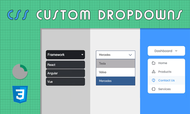
While the native <select> element offers functionality, its default css styling select appearance often falls short of design aspirations. This article empowers you to create beautiful and customizable select dropdowns using CSS and explores the potential (and limitations) of the appearance property.
The native options: limitations and possibilities
The default <select> presents basic styling, often lacking in visual appeal and lacking features like search and customizability. While HTML5 introduced the appearance property for customization, browser support remains limited and inconsistent.
While browsers like Firefox and Chrome offer varying levels of appearance customization, relying solely on it presents compatibility challenges. Therefore, we’ll primarily focus on pure CSS techniques for cross-browser compatibility.
Building the foundation: select HTML Structure and base styling
Before diving into customization, ensure a solid foundation:
<select id="custom-select">
  <option value="option1">Option 1</option>
  <option value="option2">Option 2</option>
  <option value="option3">Option 3</option>
</select>
Define a base style for the <select> element to control initial appearance:
select {
  /* Adjust these properties based on your design */
  font-family: sans-serif;
  border: 1px solid #ccc;
  padding: 8px;
  border-radius: 4px;
  display: inline-block;
}
The art of customization: tailoring styles with SCSS
SCSS offers powerful features like nesting and mixins for cleaner and more maintainable code:
Mixing it Up with a Mixin:
@mixin select-base {
  font-family: sans-serif;
  border: 1px solid #ccc;
  padding: 8px;
  border-radius: 4px;
  display: inline-block;
}

select {
  @include select-base;
}
Styling the Dropdown Arrow:
Use the ::-ms-expand pseudo-element for Internet Explorer support:
select::-ms-expand {
  display: none;
}

select::after {
  /* Configure arrow symbol and positioning */
  content: "";
  display: block;
  border: solid #ccc;
  border-width: 0 4px 4px 0;
  position: absolute;
  right: 10px;
  top: 50%;
  transform: translateY(-50%);
}
Customizing Options and Hover States:
Target the option elements and their hover states for styling:
option {
  background-color: #fff;
  color: #333;
  padding: 8px;
}

option:hover {
  background-color: #eee;
}
Remember to adapt these styles to your specific design needs and experiment with colors, fonts, and borders to create unique looks.
Exploring the appearance property: cautious optimism
While utilizing appearance property can potentially simplify styling in supported browsers, consider its limitations:
- Inconsistent Browser Support: Functionality across browsers varies significantly.
- Limited Customizability: It primarily removes default styling without offering fine-grained control.
If your target audience predominantly uses modern browsers with good appearance support, you can use it in conjunction with CSS for further styling:
select {
  appearance: none; /* Removes default styling */
  /* Apply your custom CSS styles here */
}
However, always ensure graceful degradation for users with older browsers.
Beyond the basics: advanced techniques and inspiration
For more intricate designs, consider advanced techniques like:
- Using JavaScript for dynamic behavior: Enhance functionality with search, filtering, and accessibility features.
- CSS frameworks and libraries: Leverage pre-built components and utilities for faster development.
- Exploring design inspiration: Seek inspiration from online resources and design trends to create visually stunning select boxes.
Remember, accessibility is crucial. Ensure your custom select dropdown works well for users with assistive technologies like screen readers.
Conclusion to styling select dropdowns
While the appearance property holds promise, mastering pure CSS techniques empowers you to styling beautiful and cross-browser compatible custom select dropdowns. Embrace the power of SCSS, explore advanced techniques, and use these guidelines to design exceptional user experiences that meet both form and function.