CSS gradients offer a powerful way to create a Photoshop-like transparency background, replicating transparency effects and even surpassing Photoshop’s limitations. Get ready to dive into the vibrant world of CSS gradients and explore:
- Transparency magic: Achieve transparency transitions using various gradient types.
- Beyond opacity: Experiment with color stops and direction for unique effects.
- SCSS mixins: Simplify complex gradients for reusability and maintainability.
- Browser compatibility: Understand support and use fallbacks for older browsers.
Basic example
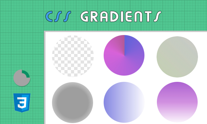
A basic trick can be to show grey and white boxes.
.transparent-back {
  background-image: -webkit-linear-gradient(45deg, #d9d9d9 25%,transparent 25%,transparent 75%,
#d9d9d9 75%,#d9d9d9), -webkit-linear-gradient(45deg,#d9d9d9 25%,transparent 25%,transparent 75%,#d9d9d9 75%,#d9d9d9);
  background-color:#fff;background-position:0 0,10px 10px;background-size:21px 21px;
  -webkit-background-size:21px 21px;-webkit-box-shadow:0 5px 35px rgba(0,0,0,.65)
}
Transparency Tricks: Fading Away in Style
Linear Gradient: The workhorse of gradients, perfect for horizontal or vertical fades. Achieve transparency by defining stops with varying degrees of opacity:
.transparent-box {
  background: linear-gradient(to right, rgba(255, 0, 0, 0.8) 0%, rgba(255, 0, 0, 0) 100%);
}
Radial Gradient: Create circular transparency effects:
.radial-fade {
  background: radial-gradient(at center, rgba(0, 0, 0, 0.5) 50%, rgba(0, 0, 0, 0) 100%);
}
Experiment with color stops: Use multiple stops with varying opacities and colors for custom effects. Remember, percentages denote position within the gradient, not specific pixels.
Expanding Your Palette: Creative CSS Gradients
CSS gradients go beyond transparency. Explore color and direction options:
Diagonal Fades: Add dynamism with angled gradients:
.diagonal-gradient {
  background: linear-gradient(45deg, #e3f2fd, #fff);
}
Multiple Colors: Create visually striking blends:
.multicolor-gradient {
  background: linear-gradient(to bottom, #f0a500, #f7db4f, #fff);
}
Conic Gradient: Achieve stunning circular color transitions:
.conic-rainbow {
  background: conic-gradient(from 0deg, red 0%, orange 40%, yellow 80%, green 120%);
}
Remember: Experiment with color combinations and directions to unleash your creativity.
Supercharge Your Workflow with SCSS Mixins
Define reusable gradient styles using SCSS mixins:
@mixin transparent-fade($color, $opacity) {
  background: linear-gradient(to right, rgba($color, $opacity) 0%, rgba($color, 0) 100%);
}

.red-fade {
  @include transparent-fade(red, 0.7);
}

.blue-fade {
  @include transparent-fade(blue, 0.5);
}
Mixins promote code organization and make it easier to update gradient styles across your project.
Browser compatibility: keeping everyone included
While modern browsers support most gradients, older versions might need fallbacks. Use background-image with a solid color as a fallback for unsupported properties:
.fallback-gradient {
  background: -webkit-linear-gradient(to right, rgba(255, 0, 0, 0.8) 0%, rgba(255, 0, 0, 0) 100%); /* Chrome, Safari */
  background: linear-gradient(to right, rgba(255, 0, 0, 0.8) 0%, rgba(255, 0, 0, 0) 100%); /* Modern browsers */
  background-color: red; /* Fallback for older browsers */
}
Remember to test your gradients thoroughly across different browsers and devices.
Conclusion for CSS gradients
CSS gradients offer a world of possibilities for creative backgrounds. Embrace transparency effects, experiment with colors and directions, and take advantage of SCSS mixins for efficient workflow. Remember browser compatibility and use fallbacks to ensure your website reaches everyone.