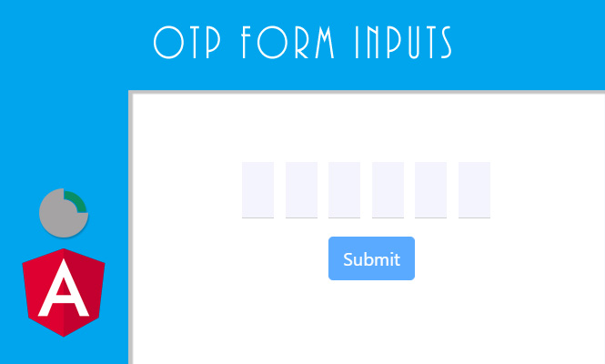
Today we will see the OTP form inputs.
On some occasions it may be useful to have a particular “PIN” type field, divided into several single character fields. This make it easier for the user to type potentially random characters (and therefore difficult to line up and memorize).
The ingredients in our form field are the classic ones, which you can also find in other recipes. What changes is how you mix them:
The styles
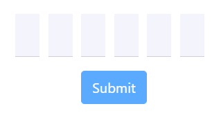
Let’s start with the easiest part, the styles to set. In the example below we will make a field with 6 fixed characters to set. If you already have the styles ready for this kind of field, you can safely skip this part.
.form-pincode {
  display: inline-block;
  margin: 20px auto;
  .form-control {
    width: 28px;
    margin-right: 10px;
    font-size: 24px;
    text-align: center;
    font-style: normal;
    padding: 0;
  }
  .last {
    margin-right: 0;
  }
}
input.form-control {
  border-color: #d0d0d0;
  border-width: 0 0 1px;
  border-style: solid;
  border-radius: 0;
  background-color: rgb(244, 244, 253);
}
The component
The fulcrum of everything is found in the component, where you can see how the retrieval of the fields array takes place through: @ViewChildren('otpElements') which denotes all the fields and the onOtpInputChange() method which checks:
- If there is a subsequent field on which to impose the focus.
- If we have filled the field with a character.
With the onOtpInputFocus() method we make sure that at the first focus on the field the user is directed directly to the first character. If the user tries again to go to subsequent fields then the method does not insist and lets him focus on the character he wants.
  fieldsLength = 6;
  otpCode = Array(this.fieldsLength).fill(null).map((_, i) => Object({ name: `code${i}` }));
  firstFocus: boolean = true;
  @ViewChildren('otpElements') otpElements: QueryList<ElementRef>;

  /**
   * On otp field filled move cursor on the next one.
   */
  onOtpInputChange(i: number): void {
    if (i < this.fieldsLength - 1) {
      const elements = this.otpElements.toArray();
      if (elements[i].nativeElement.value &&
        elements[i].nativeElement.value.length > 0) {
        elements[++i]?.nativeElement.focus();
      }
    }
  }

  /**
   * On first focus move cursor to start otp field.
   */
  onOtpInputFocus(index: number): void {
    if (!this.firstFocus) {
      return;
    }
    this.firstFocus = false;
    if (index !== 0) {
      this.otpElements.toArray()[0].nativeElement.focus();
    }
  }
The HTML of OTP form input
Obviously let’s not forget the last part, the template, in which we cycle the html of the necessary fields. For completeness, I insert the complete form in the example code.
<form novalidate [formGroup]="otpForm" #formOtp="ngForm" (submit)="submit()" autocomplete="off" class="form-pincode">
  <div class="row">
    <div class="form-group form-group-lg"
      *ngFor="let c of otpCode; let i = index">
      <input
        class="form-control control-pincode"
        id="otpCode{{ i }}"
        (input)="onOtpInputChange(i)"
        #otpElements
        (focus)="onOtpInputFocus(i)"
        name="{{ c.name }}"
        formControlName="{{ c.name }}"
        placeholder=""
        type="text"
        maxlength="1"
      />
    </div>
  </div>
  <div class="row">
    <div class="col-sm-12">
      <button type="submit" class="btn btn-primary" [disabled]="otpForm.invalid">
        Submit
      </button>
    </div>
  </div>
</form>
The working example is below.
And with that, that’s it, about the OTP form inputs.
Try it at home.