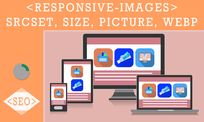
In today’s diverse device landscape, delivering optimized images for optimal performance and user experience is crucial. This article delves into the world of responsive images, equipping you with the knowledge and code examples to implement efficient solutions using srcset, sizes, the <picture> tag, and the versatile WebP format.
Understanding the challenge: one size doesn’t fit all
Delivering large, high-resolution images to all devices, regardless of their capabilities, can lead to slow loading times and wasted bandwidth. Conversely, serving low-resolution images on high-resolution displays results in poor visual quality.
Understanding responsive images: the challenge and the solution
Serving a single image size across all devices isn’t ideal. Large images lead to slow loading times on mobile devices, while small images appear blurry on high-resolution screens. Responsive images address this by delivering the most appropriate image size based on the user’s device and screen dimensions.
Enter the heroes: srcset and sizes
srcset: This attribute specifies a list of image sources with their corresponding widths, allowing the browser to choose the best fit.
<img srcset="image-320w.jpg 320w, image-640w.jpg 640w, image-1280w.jpg 1280w" alt="Responsive Image">
sizes: This attribute defines the intrinsic size of the image in CSS viewport units (vw), ensuring proper scaling and layout.
<img
  srcset="image-320w.jpg 320w, image-640w.jpg 640w, image-1280w.jpg 1280w"
  sizes="(max-width: 640px) 100vw, (max-width: 1280px) 50vw, 33.3vw"
  alt="Responsive Image">
Remember, browsers interpret srcset first, then use sizes to choose the best source from the list.
The power of the <picture> Tag: taking control
The <picture> tag provides even more control over image selection. It contains multiple <source> elements, each specifying an image source and media query for specific device conditions. The browser parses these sources and chooses the first one matching the current device and viewport size.
<picture>
  <source srcset="image-mobile.jpg" media="(max-width: 768px)">
  <source srcset="image-tablet.jpg" media="(max-width: 1024px)">
  <img src="image-desktop.jpg" alt="Responsive Image">
</picture>
WebP: The Lightweight Champion
WebP is a modern image format offering significantly smaller file sizes while maintaining comparable quality to JPEG. By including WebP as a source in your srcset or <picture> tag, you can further optimize image delivery:
<picture>
  <source srcset="image.webp" type="image/webp">
  <source srcset="image.jpg">
  <img src="image.jpg" alt="Responsive Image">
</picture>
Note: Not all browsers support WebP yet, so consider including a fallback image as shown in the example.
Putting it all together: code examples
Let’s see how these techniques translate into practical examples:
<picture>
  <source srcset="/image-mobile.webp" type="image/webp" media="(max-width: 768px)">
  <source srcset="/image-tablet.webp" type="image/webp" media="(max-width: 1024px)">
  <img src="/image-desktop.jpg" alt="Responsive Image" src="image.jpg">
</picture>
Note: Adapt these examples to your specific framework and project structure.
Beyond the Basics: advanced techniques and considerations
- Automatic image conversion: Explore tools like gulp-webp or webpack plugins to automate WebP conversion during build processes.
- Lazy loading: Load images only when they become visible in the viewport for further performance optimization.
- Accessibility: Ensure appropriate alt text and semantic HTML usage for users with assistive technologies.
Benefits of responsive images: performance, efficiency, and user experience
By implementing responsive images with srcset and sizes, you:
- Improve website loading speed: Smaller images load faster, enhancing user experience.
- Reduce bandwidth usage: Delivering only the necessary image size saves bandwidth, particularly for mobile users.
- Boost SEO: Search engines favor websites with efficient image loading.
- Create a visually appealing experience: High-quality images on high-resolution devices enhance user engagement.
Conclusion: embrace responsive images for a brighter future
Mastering responsive images empowers you to create websites that adapt beautifully to diverse devices and deliver optimal performance for all users. With these tools and techniques, you can ensure a visually stunning and efficient web experience that sets your project apart. Remember, testing across different devices and browsers is crucial to ensure flawless implementation. So, embrace responsive images and watch your website thrive across the digital landscape!