Let’s talk about the CSS VH and VW units.
Today’s websites must adapt better and better to new generations of browsers due to the fact that there is no longer a single type of device on which our site can be viewed. There are now an infinite series of devices, including televisions, smartphones, large and tiny PCs, tablets.
In this array of devices, flexible units of measure can help us, which adapt easily to the dimensions (in width and height) of the device that contains them.
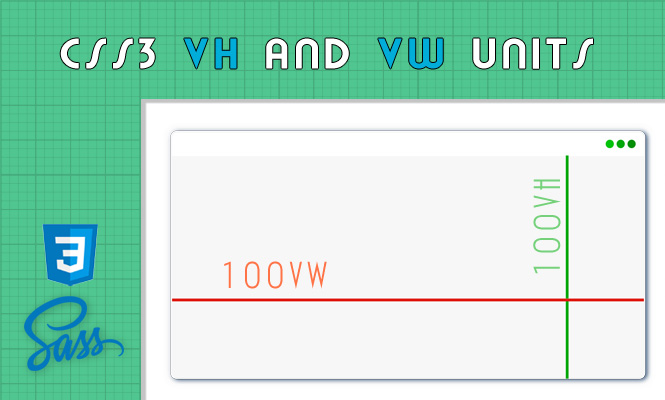
I’m obviously talking about the units of measurement vh and vw that stand for:
vh = "viewport height"
vw = "viewport width"
With these units the browser goes to recover the context dimensions without any effort on our part.
With these units the browser goes to recover the context dimensions without any effort on our part.
Very convenient when you want a page on your site that is perfectly equal to the size of your window or when you want a perfect centering of something within the aforementioned page.
Each vh and vw unit is equal to 1% of the height and width of the browser window. However, there is an important differentiation to be made, compared to the classic percentage (%). The percentage refers to its container while these two units of measurement refer only and only to the window.
To achieve the same effect in javascript, you can use two properties of the window object:
window.innerHeight
window.innerWidth
It goes without saying that it is always convenient to use CSS styles when it comes to style needs.
That’s all, with the CSS VH and VW units.
Try it at home!