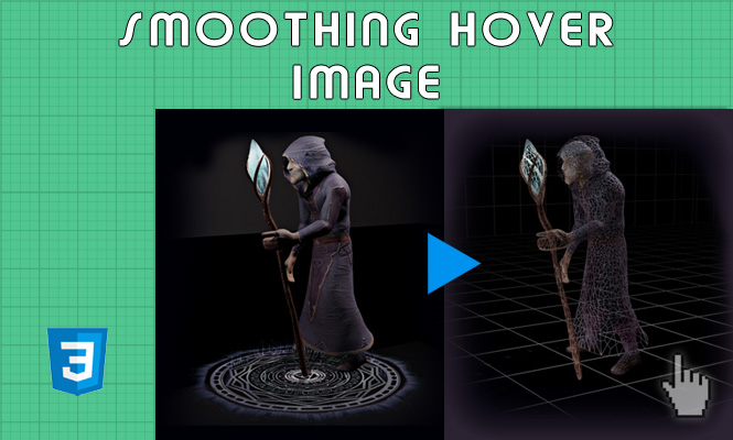
Today we will see how to provoke the smooth hover of images, that is when, going with the mouse on one image you see another one. This behavior is easy when talking about other types of objects such as div or text but it is a little more complicated in the case of images.
This effect will improve the classic :hover rule of CSS styles, adding a smooth transition from a normal image to a focused image.
We will use CSS3 rules so any old browsers will not be supported but this will not be a problem, as it is ultimately a mere aesthetic effect.
We can start with simple html.
<h1 id="my-image">
  <span></span>
  <span class="hover"></span>
</h1>
We create a span tag for the base image and another tag that will appear only at the event :hover of the container.
#my-image {
  display: block;
  margin: 0 auto;
  position: relative;
  width:500px;
}
span {
  background-image: url("https://tools.obyte.it/public/sliders/alchemistRender.jpg");
  background-size: 100%;
  background-repeat: no-repeat;
  display: block;
  width: 500px;
  height: 281px;
}
span.hover {
  background-image: url("https://tools.obyte.it/public/sliders/alchemistRenderWire.jpg");
  position: absolute;
  top: 0;
  left: 0;
  opacity: 0;
  transition: opacity 0.6s ease-in-out;
}

#my-image:hover span.hover {
  opacity: 1;
}
With transition: opacity 0.6s we can delay the display of the image in hover.
As you can see we are not using the :hover pseudo-rule but a simple class .hover. On it we are going to apply a delay on the opacity via transition.
We enter the absolute position to also make sure that the two images overlap perfectly. Be careful to make sure that the hover image is superimposable with the base one, without effect.
Here the code widget:
That’s all for smooth hover on images.
Try it at home!
