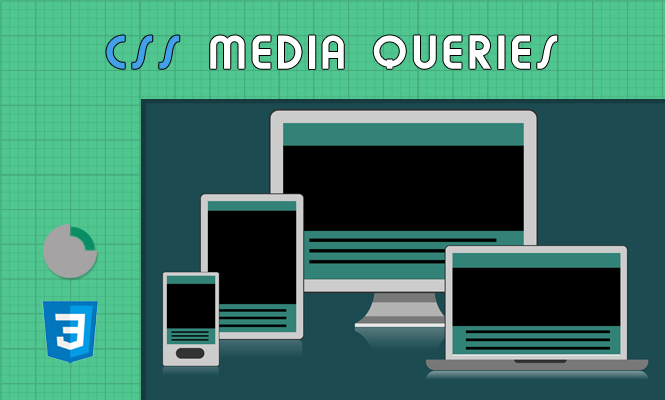
In the era of diverse devices and screen sizes, crafting beautiful and adaptable web experiences is crucial. Enter media queries, powerful tools within CSS and SCSS that allow you to tailor your styles based on specific device characteristics. This article delves into the world of media queries, empowering you to create truly responsive web designs with practical SCSS and CSS code examples.
Understanding the anatomy of media queries syntax
A media query consists of two main parts:
- Media Feature: Defines the condition to check, like screen size, resolution, or orientation (e.g.,
(min-width: 768px),(orientation: portrait)) - Media Block: Contains CSS styles that apply only when the specified condition is met
Here’s the basic syntax:
@media (media feature) {
  /* CSS styles that apply under the specified condition */
}
Diving into SCSS: leveraging nesting and variables for cleaner Code
SCSS, a superset of CSS, offers features like nesting and variables that can enhance media query usage:
1. Nesting for Organized Structure:
@media (min-width: 768px) {
  .container {
    @include flexbox; // Include a pre-defined mixin for flexbox layout
    width: 80%;
    .sidebar {
      width: 20%;
    }
  }
}
2. Variables for Flexibility and Maintainability:
$tablet-breakpoint: 768px;

@media (min-width: $tablet-breakpoint) {
  .container {
    width: calc(100% - ($tablet-breakpoint + 20px)); // Dynamic calculations based on variables.
  }
}
These features promote cleaner and more maintainable code, especially when dealing with complex responsive layouts.
Beyond the basics: exploring advanced Media Query techniques
While basic queries cover many scenarios, advanced techniques can handle more intricate situations:
- Media Feature Combinations: Use logical operators like
and,or, andnotto create complex conditions (e.g.,(min-width: 768px) and (max-width: 1024px)) - Media Feature Queries: Target specific device features like resolution or pointer type (e.g.,
(resolution: 300dpi),(pointer: coarse)) - Responsive Images: Use the
srcsetattribute and media queries to deliver device-appropriate image sizes.
These techniques provide fine-grained control over styles, ensuring optimal rendering across various devices.
Bringing it all together: code examples for different devices
Let’s see how media queries translate into concrete styling scenarios:
1. Adapting Layout for Tablets:
@media (min-width: 768px) {
  .content {
    float: left;
    width: 60%;
  }
  .sidebar {
    float: right;
    width: 40%;
  }
}
2. Optimizing Images for High-Resolution Screens:
<img src="image.jpg" alt="My Image"
  srcset="image-640.jpg 640w, image-800.jpg 800w, image-1200.jpg 1200w"
  sizes="(max-width: 640px) 100vw, (max-width: 800px) 50vw, 33vw">
3. Adjusting Font Sizes for Mobile Devices:
@media (max-width: 480px) {
  body {
    font-size: 16px;
  }
}
Remember to test your responsive design thoroughly on different devices and screen sizes to ensure a seamless user experience.
Conclusion: media queries – your key to responsive design
Media queries empower you to build websites that adapt beautifully to diverse environments. By mastering their syntax, leveraging SCSS features, and exploring advanced techniques, you can create truly responsive web experiences that cater to your users regardless of their device. So, embrace the power of media queries and watch your web designs come alive across the digital landscape!
