I like the hexagons – it’s my favorite geometric shape. Not trivial as a circle can be, but not minimalist as are the forms “poorest” of angles, such as squares or triangles.
Symmetry reigns supreme with them.
This article is dedicated to all those people who are tired of border-radius and who cannot see straight edges.
For these reasons, over time I have looked for many possible ways to create CSS hexagons, with text content, images or simply for aesthetics.
We can find it in 4 flavours:
One-color hexagon
This is the simplest and most compatible way of what a hex can be.
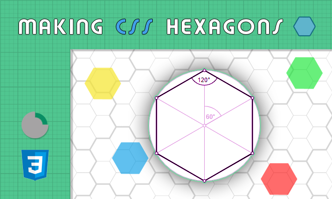
In this case we have no big hexagonal needs. The important thing is that there are 6 corners.
A limitation of this way is that the hexagon must only be of one color because the straight and oblique edges are artificially create.
All the html we need is a single tag.
<div class="hex generic"></div>
While we have something more to write as CSS.
.hex.generic {
  position: relative;
  width: 82px;
  height: 47.34px;
  line-height: 23px;
  background-color: rgb(47, 170, 177);
  margin: 40px auto;
  color: white;
  text-align: center;
}
.hex.generic:before,
.hex.generic:after {
  content: "";
  position: absolute;
  left: 0;
  width: 0;
  border-left: 41px solid transparent;
  border-right: 41px solid transparent;
}
.hex.generic:before {
  bottom: 100%;
  border-bottom: 23.67px solid rgb(47, 170, 177);
}
.hex.generic:after {
  top: 100%;
  width: 0;
  border-top: 23.67px solid rgb(47, 170, 177);
}
If you want a lying hex instead:
.hex.generic-2 {
  position: relative;
  width: 47.34px;
  height: 82px;
  line-height: 36px;
  font-size: 14px;
  background-color: rgb(47, 170, 177);
  margin: 40px auto;
  color: white;
  text-align: center;
  overflow: visible;
}
.hex.generic-2:before,
.hex.generic-2:after {
  content: "";
  position: absolute;
  top: 0;
  width: 0;
  border-top: 41px solid transparent;
  border-bottom: 41px solid transparent;
}
.hex.generic-2:before {
  right: 100%;
  border-right: 23.67px solid rgb(47, 170, 177);
}
.hex.generic-2:after {
  left: 100%;
  width: 0;
  border-left: 23.67px solid rgb(47, 170, 177);
}
The result is the following:
hexagon
hex (2)
Image hexagon
In this case we have an image that we want to enclose in a hexagonal shape, without resorting to graphics programs.
A limit, to watch out for, is that in this case the edges of the image are hidden, so we will be forced to have a one-color background, in order not to reveal the trick.
Here too the HTML is reduced to a tag.
<div class="hex image"></div>
The CSS to write will surely be for the background of the image and the triangular edges that will act as a “mask” for the edges of the image.
.hex.image {
  width: 240px;
  height: 200px;
  background: transparent
    url("https://tools.obyte.it/public/models/images/spaceship_2.jpg") no-repeat;
  background-size: cover;
  background-position: center center;
  position: relative;
}
.hex.image:before {
  content: "";
  position: absolute;
  top: 0;
  left: 0;
  width: 0;
  height: 0px;
  border-right: 70px solid transparent;
  border-bottom: 100px solid #333;
  border-top: 100px solid #333;
}
.hex.image:after {
  content: "";
  position: absolute;
  top: 0;
  right: 0;
  width: 0;
  height: 0;
  border-left: 65px solid transparent;
  border-bottom: 100px solid #333;
  border-top: 100px solid #333;
}
The result is the following:
SVG hexagon
My favorite version, the most powerful and innovative way to generate a hexagon: <svg>.
SVGs are an efficient way to creating stylized images. The images created with svg are vectorial, that is, they do not get damaged (grainy) with enlargements or deformations.
In this case the CSS can disappear because the secret ingredient of the svg is the xml, which goes perfectly with the html in which it is immersed.
<svg
  xmlns="http://www.w3.org/2000/svg"
  xmlns:xlink="http://www.w3.org/1999/xlink"
  width="265"
  height="203"
  viewBox="0 0 465 403">
  <defs>
    <path id="a"
      d="M913.25 149h232.5L1262 350.5 1145.75 552h-232.5L797 350.5z"
    />
  </defs>
  <g fill="none" fill-rule="evenodd" transform="translate(-797 -149)">
    <use fill="#1D4371" xlink:href="#a" />
    <use fill="#000" filter="url(#b)" xlink:href="#a" />
  </g>
</svg>
The result is the following:
Unicode CSS hexagon
Besides this version there is also a “font” version of CSS hexagons. This using an HTML entity of one of the unicode characters.
In this case it is the character ⬢ which would be the hexagon. In this way the html part is very concise. For the CSS part you can use the same rules as for normal text.
This variant is less versatile, in my opinion, than the others since it is unicode text. Compared to the hexagons made purely in css, for example, it is not possible to easily insert text in the body of the figure, since it is itself text.
Clearly each hexagon must have the properties already described above, in the paragraph One-color hexagon.
For example:
- font-size
- color
- text-align
<span>⬢</span>
Bonus CSS hexagons shapes
Once we have created our shapes, we can also decide to play a bit with them and with their arrangements.
Tiled CSS hexagons
For example, we can queue the hexagons as tiles. To do this we divide the hexagons into rows, each with a certain number of hexagons. These rows of hexagons will have a float: left to wrap the hexagons horizontally and a clear: left to wrap them after each row.
The corner of the hexagon is just an edge and isn’t really part of the shape. For this reason we will have to correctly space the hexagons in height we need a margin-bottom (set to the minimum of the same amplitude of the hexagon angle). In reality our hexagon is just a rectangle with an extra border.
As a final touch, even rows should be shifted by at least half the width of the hexagons. In this way we center the upper and lower points exactly between two hexagons. We will therefore use margin-left on odd or even rows. In our case we then add a few pixels of margin-right for each hexagon (to leave a border between the two), a few more pixels of margin-bottom between the lines. All this will be reflected in the shift of the even or odd rows that we will have to impose.
.hex.generic.tiled {
  float: left;
  margin-bottom: 26px;
  margin-right: 4px;
}
.hex-row.tiled {
  clear: left;
}
.hex-row.tiled.even {
  margin-left: 46px;
}
<div class="hex-container tiled">
<div class="hex-row tiled odd">
<div class="hex generic tiled"> </div>
<div class="hex generic tiled"> </div>
<div class="hex generic tiled"> </div>
</div>
<div class="hex-row tiled even">
<div class="hex generic tiled"> </div>
<div class="hex generic tiled"> </div>
<div class="hex generic tiled"> </div>
</div>
</div>
3D CSS hexagons
Once we have our hexagons stacked like a beehive we can then think of making them even more dynamic, adding a 3D perspective to everything, with an ad hoc container.
.hex-3d-container {
  transform: perspective(300px) rotateX(50deg);
  padding-left: 100px;
}
Below are the results mixed together of all CSS hexagons versions, seen so far:
That’s all for now.
Try it at home!
One thought on...